

ui design
Below are examples of work personally done during a course I enrolled in to learn more about product design. While focusing more on the UI aspect of product design, this course did encourage students to think deeply about the user’s experience, and implement smart design practices.
Press play above to view experience
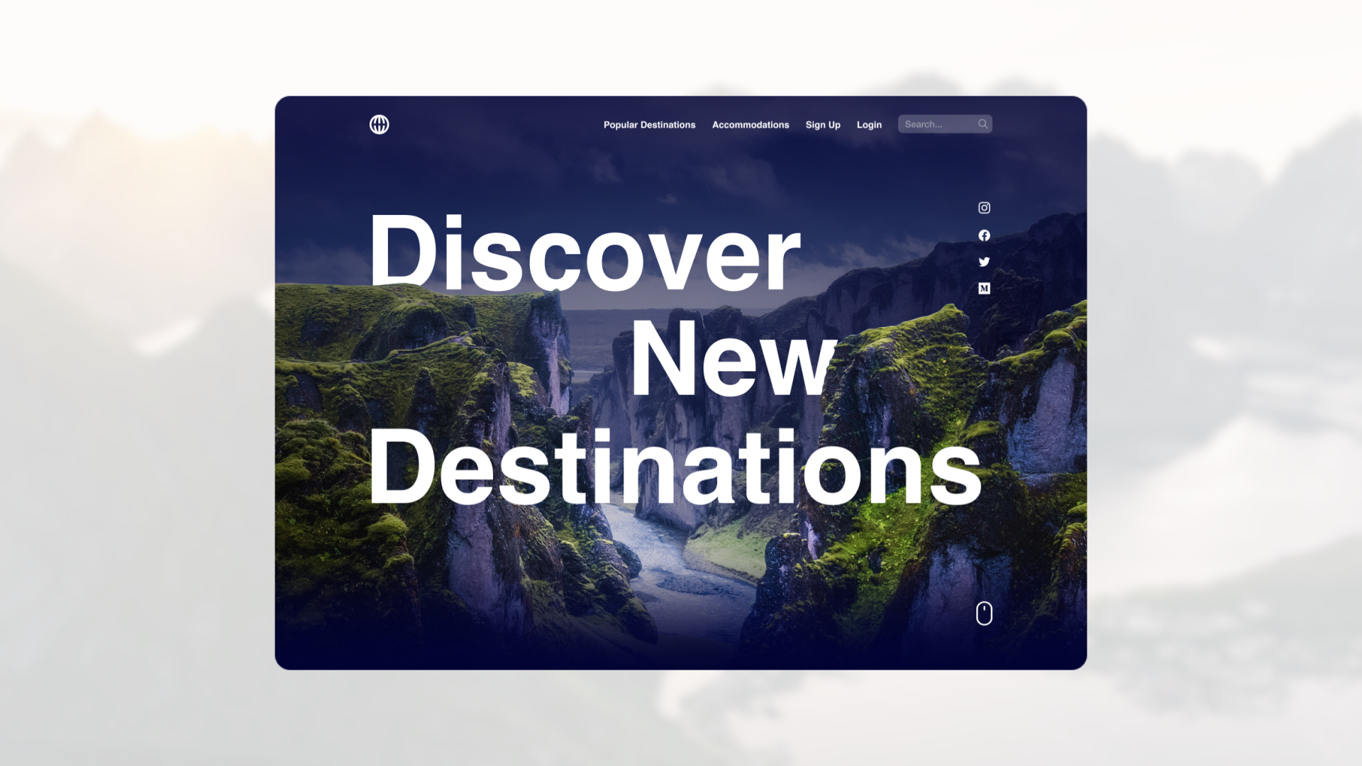
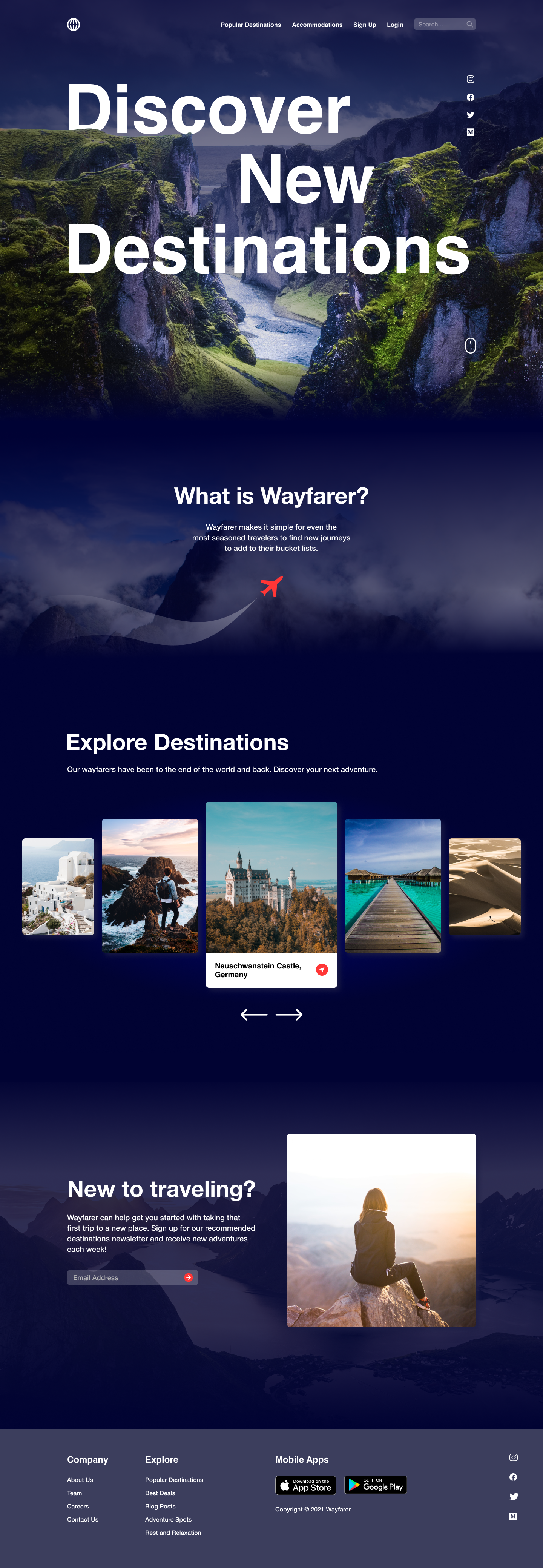
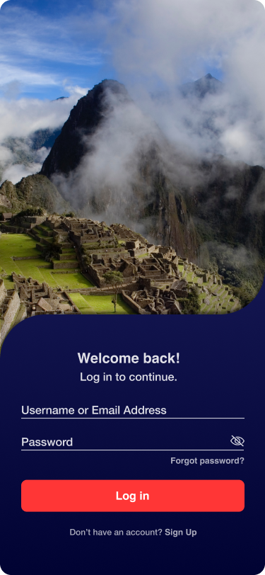
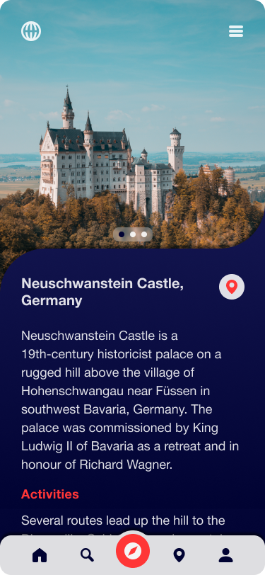
Wayfarer
WHOWayfarer, a travel website, is a place for travelers to discover new locations to visit around the world.
GoalCreate a new landing page and mobile app design.
backgroundWayfarer’s target audience is anyone between the ages of 21 and 30 who travels frequently and is in search of new adventures. It doesn’t directly sell any trips, flights, or accommodation on the site, people use it as a tool for researching where to travel next, based on their preferences.
RequirementsDesktop design must include:
Navigation to other pages or sections on the site.
Simple search functionality to find destinations
A grid or list view of featured destinations (these would link through to further details)
Call-to-action to sign up for the newsletter
A footer section including at least a copyright date and some links to other pages.
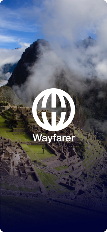
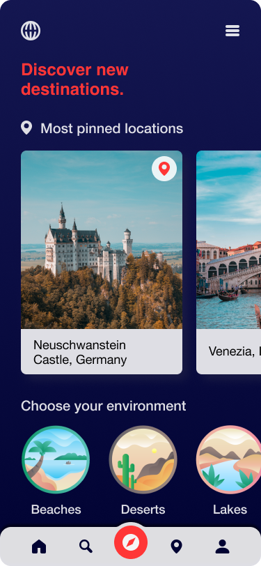
Mobile app design must include these 3 screens:
Screen 1: List of destinations
Screen 2: A “detail” screen, giving full information about a destination
Screen 3: One of the following: Sign-in screen; Search screen; Account settings screen
Thoughts
I wanted the user to immediately be immersed in a picturesque landscape upon visiting the Wayfarer site, to encourage wanderlust. I used a parallax effect in the hero to create depth, and a bouncing mouse icon to indicate the user should scroll the length of the page. Throughout the site I included small animations that wouldn’t hinder load time too much, but would add interesting details and character. For the “Explore Destinations” section, I felt imagery of travel destinations would be most enticing for users to want to view more, and then location next most important. The carousel feature also previews multiple destinations at once so the user will have many possible options that they would want to explore. At the end, I include the call to action to sign up for newsletters, and links for both Apple and Android devices to download the mobile app.
In the mobile app design, I organized content to feel like there was plenty of breathing room for everything, while also having plenty of enticing imagery. “Most pinned locations” would likely be most interesting for users upon visiting the app, so they could quickly see destinations they would like to try. It is then followed by a breakdown of environment types to categorize what kind of destination the user may want to visit. In the location details page, I included a section at the top to view more images of a location, a short description, and then there would be listed activities you could do in the area.
Landing Page Design
Mobile App Design
Press play above to scroll through
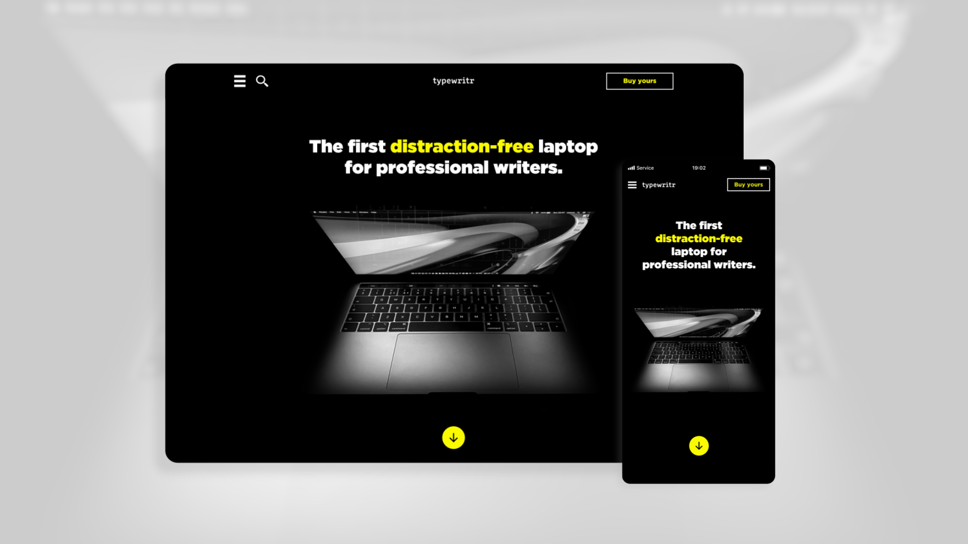
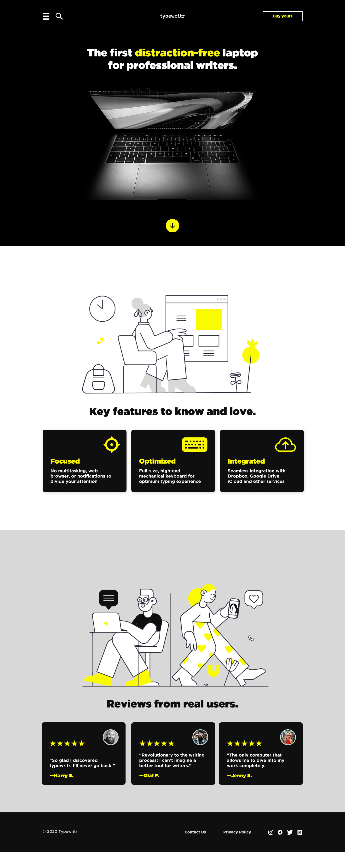
typewritr
WHOTypewritr is a new distraction-free laptop for professional writers.
GoalDesign a responsive homepage (desktop and mobile versions) with a call-to-action for customers to place an order.
STIPULATIONSClient has provided a logo, and copy. Design must be in brand colors of yellow (#FAFA00), grey, and black. You may only use a sans-serif font.
Thoughts
This was a practice in responsive design. I kept the use of the yellow brand color low, and only to accent key details I wanted the user to notice. The clear call to action in the top right corner would remain at the top as you scroll down the site. I kept the navigation in a collapsed menu in the top left, with the belief that users may be visiting primarily on a mobile device, since they are looking to buy a computer. The would need to be further researched to see if this hypothesis is accurate, and if it is not, then on the desktop view, we could expand the navigation at the top to feature most useful site links for users.
Desktop Landing Page Design
Mobile Landing Page Design

Press play above to scroll through
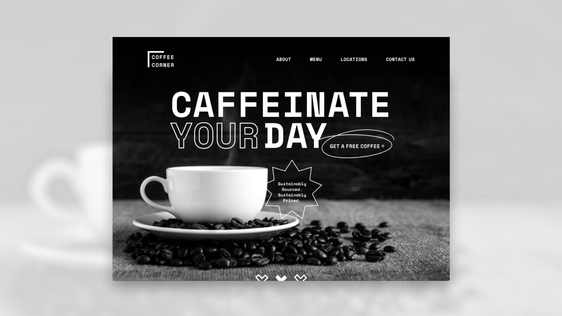
Coffee Corner
WHOA new high-end coffee shop named Coffee Corner needs a new landing page designed.
GoalGet people to sign up for the newsletter.
STIPULATIONSClient has provided a logo, copy, a set of icons, and imagery. Design must be designed in black, white, and shades of grey. You may only use one font in the design: Space Mono.
Thoughts
With the assets provided, the stipulations in mind, and goal outlined, I sketched out how I would like the page laid out. I included hand drawn circles to draw attention the CTA buttons in a way that was friendly and felt crafted by hand—just like the coffee. I chose a dark background, because the black and white photography felt dull on a lighter background. The darkness helped bring out the light areas and text, as well as making the site feel more modern for this case. I included a bottom section to once again callout the goal of getting the user to sign up for the newsletter, given the free coffee incentive.
