berkley
An industry leader in commercial and genre fiction, Berkley has a rich tradition of discovering new talent, defining emerging trends, and building authors and series into global franchises. Since Berkley has such a diverse range of genres that it covers, I wanted to create an identity for it that could be recognizable to readers, so they could begin to develop loyalty to Berkley and the amazing books it publishes.
I began using a combination of three fonts across different projects for Berkley, to develop a more cohesive look. I also leaned more into simple, abstract illustrated designs, that were very lively, but also sophisticated.
brought to you by berkley
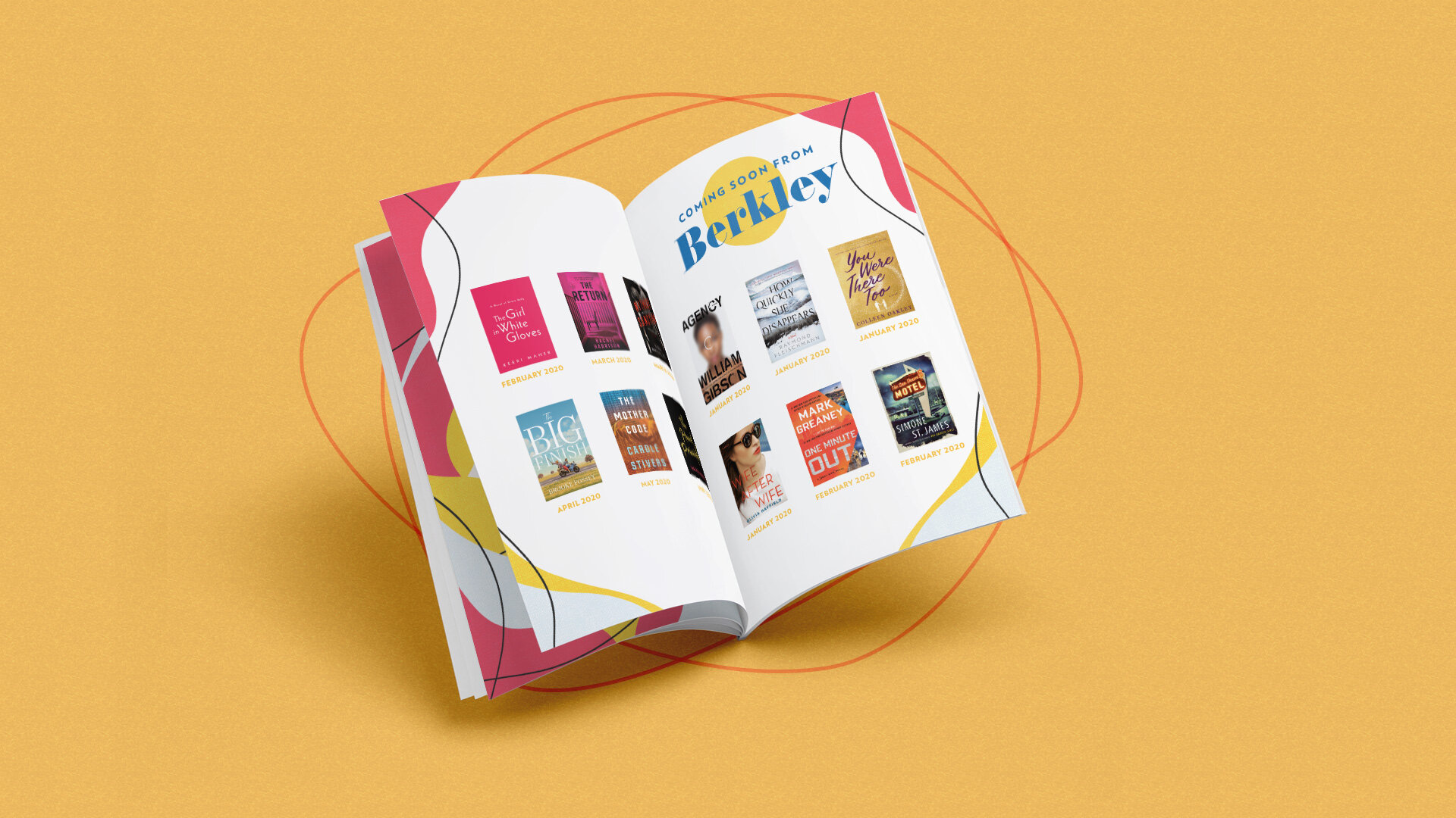
At the end of each year, Berkley showcases a few titles that they expect to be big books for the upcoming year. This event includes multiple assets, but the most important is the booklet that is given to all attendees that includes an excerpt from each highlighted title. Below are a few pages from this booklet.


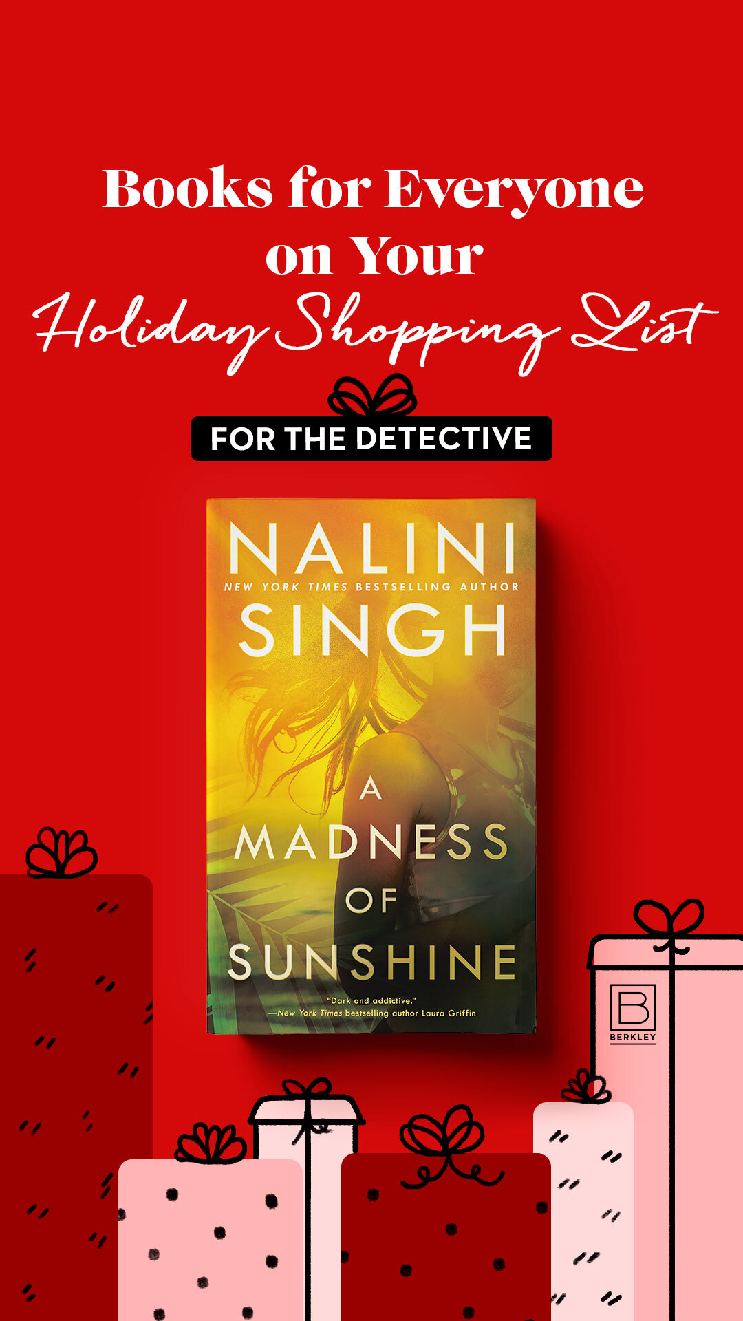
publishers weekly spring e-blast campaign
Publishers Weekly is an American weekly trade news magazine targeted at publishers, librarians, booksellers, and literary agents. Berkley ran an e-blast ad campaign to showcase their upcoming spring titles. Each slide categorizes the titles in a way that entices readers to explore further. This eblast performed exceptionally well for Berkley.

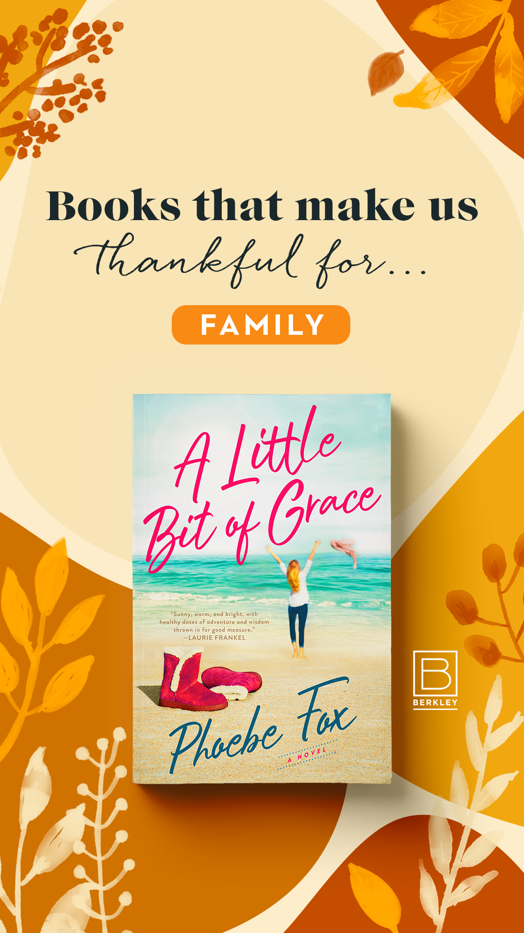
publishers weekly fall e-blast campaign
Similar to the Spring campaign, this e-blast showcases new titles that will be released in the Fall of 2021, and each slide categorizes the titles in a way that entices readers to explore further.

holiday e-blast
I illustrated a colorful holiday-themed e-blast for Berkley to send out to their authors and team members for the end of the 2020 year.

berkley stories
To create a recognizable presence on Instagram, I utilized a select few fonts whenever designing a story template or event announcement.